As part of my SOC Analyst training, I completed a lab where I built and refined a SIEM dashboard in Kibana (Elastic). The goal was to track failed logon attempts across Windows hosts and highlight suspicious activity such as repeated login failures from service or user accounts.
Step 1: Creating the Dashboard
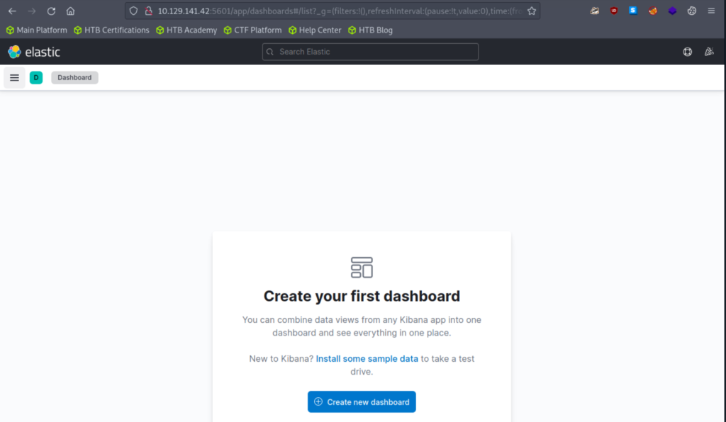
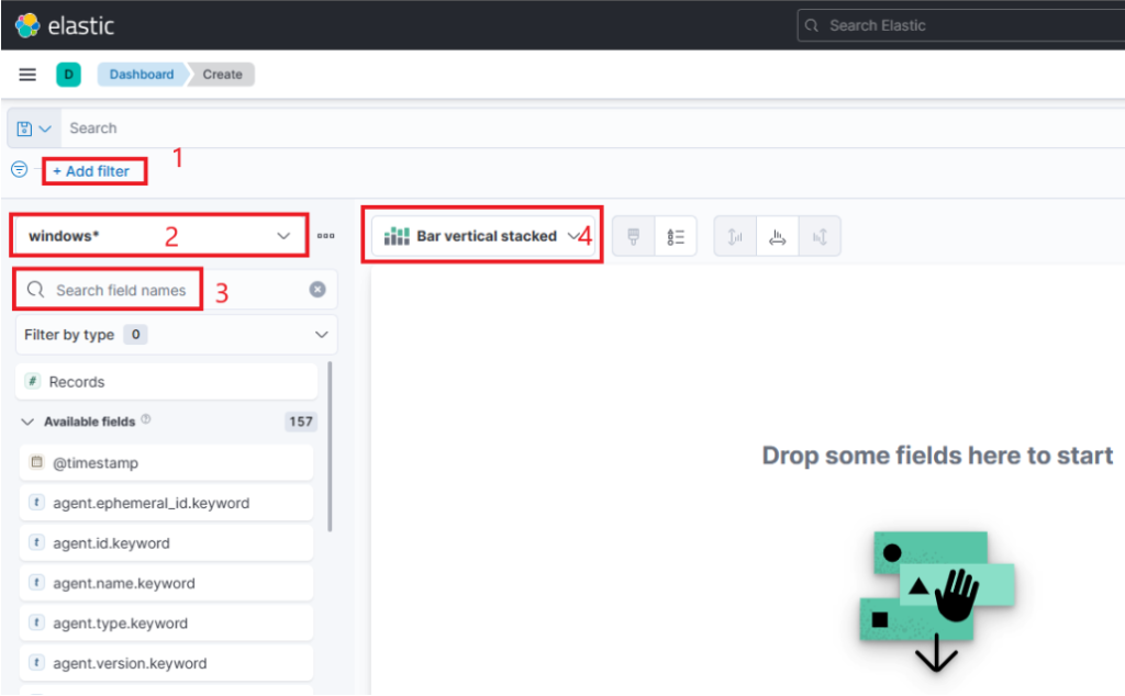
After spawning the target system, I navigated to Kibana at http://[Target IP]:5601. The first step was to remove the pre-configured SOC-Alerts dashboard so I could start fresh.
From the Dashboard tab, I deleted the default panel.
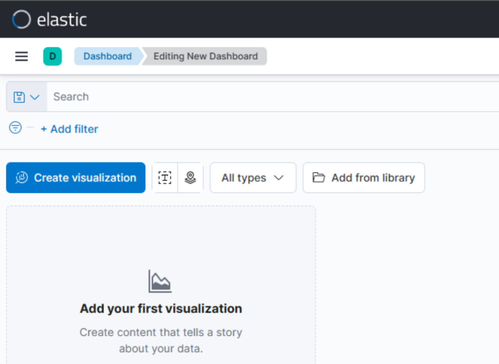
I then clicked Create new dashboard → Create visualization.
I then clicked Create new dashboard → Create visualization.
Step 2: Setting the Time Range
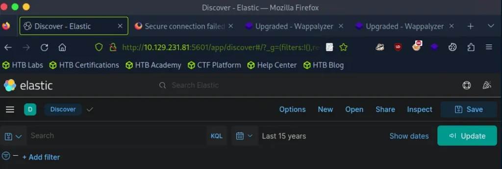
Before adding any visualizations, I adjusted the time picker to Last 15 years. This ensured the dataset covered all historical events.
Step 3: Building the First Visualization
I created a Table visualization with the following configuration:
Index Pattern:windows*
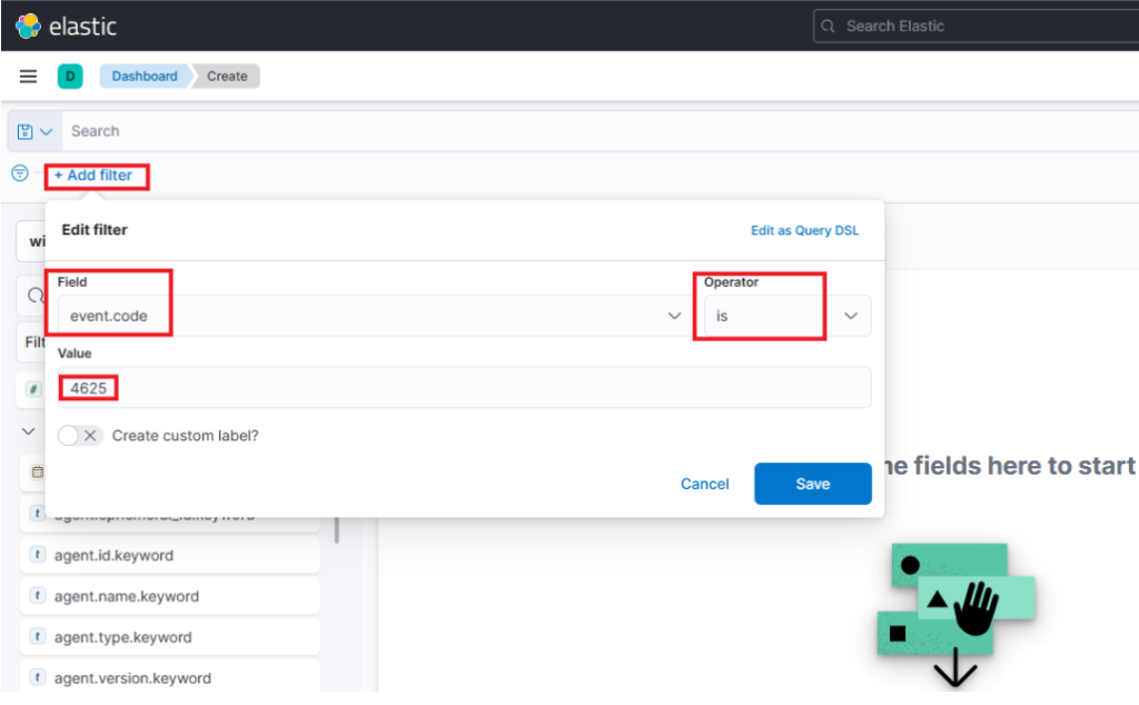
Filter:event.code: 4625 (failed logon attempts)
Rows:
user.name.keyword → Displayed as Username
host.hostname.keyword → Displayed as Event logged by
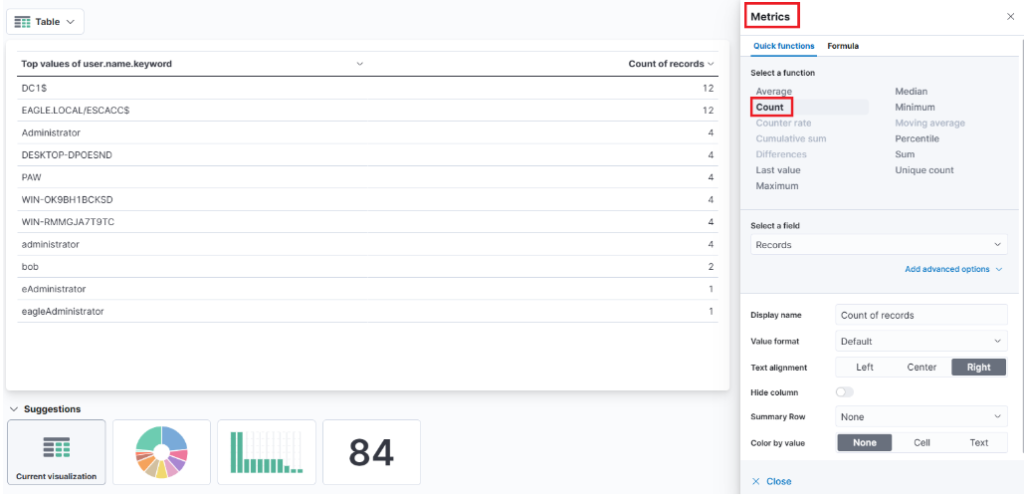
Metric:Count → Renamed to # of logins
The filter option that allows us to filter the data before creating a graph. For example, if our goal is to display failed logon attempts, we can use a filter to only consider event IDs that match 4625 – Failed logon attempt on a Windows system. The following image demonstrates how we can specify such a filter.
This search bar provides us with the ability to double-check the existence of a specific field within our data set, serving as another way to ensure that we are looking at the correct data. For example, let's say we are interested in the user.name.keyword field. We can use the search bar to quickly perform a search and verify if this field is present and discovered within our selected data set. This allows us to confirm that we are accessing the desired field and working with accurate data.
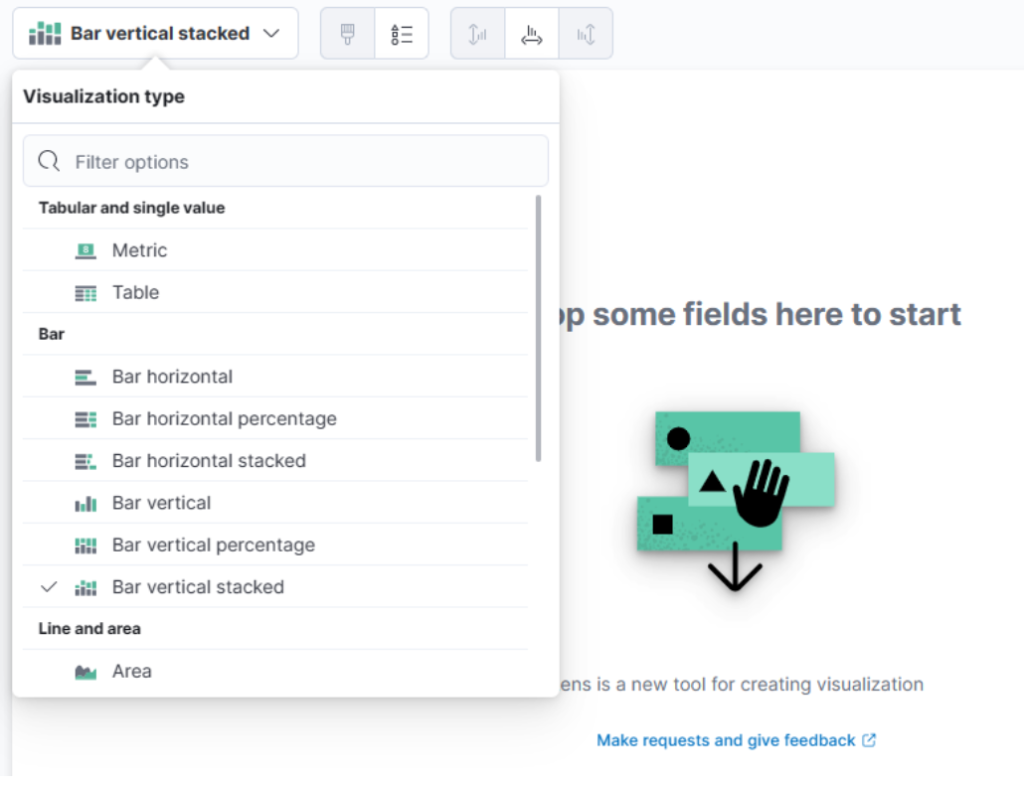
This drop-down menu lets me select the type of visualization I want to create. In the earlier image, the default option shown is “Bar Vertical Stacked.” If I click on that button, it expands to reveal additional options (not all of which are shown in the image). From this list, I can then choose the visualization type that best fits my requirements and data presentation needs.
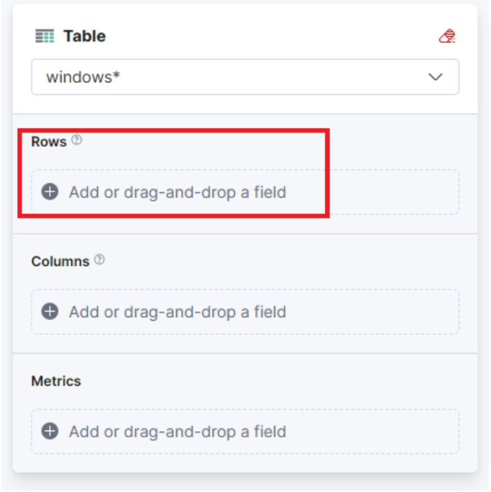
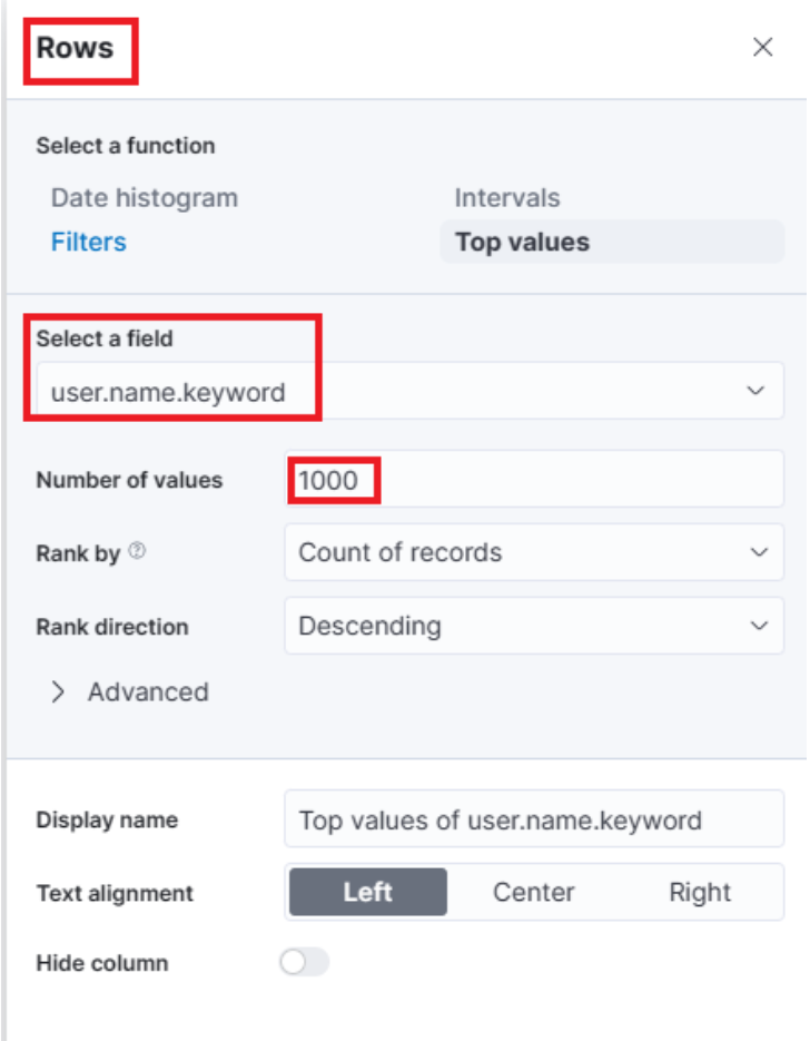
For this visualization, let’s select the “Table” option. After selecting the “Table”, we can proceed to click on the “Rows” option. This will allow us to choose the specific data elements that we want to include in the table view.
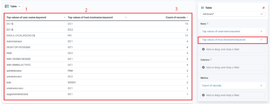
One final addition to the table is to include another “Rows” setting to show the machine where the failed logon attempt occurred. To do this, we will select the host.hostname.keyword field, which represents the computer reporting the failed logon attempt. This will allow us to display the hostname or machine name alongside the count of failed logon attempts, as shown in the image.
Now I can see three columns in the table, which contain the following information:
The username of the individuals logging in. (Currently, it shows both users and computers. Ideally, I should apply a filter to exclude computer devices so that only users are displayed.)
The machine where the logon attempt occurred.
The number of times the event has occurred, either within the specified time frame or across the entire dataset, depending on the settings.
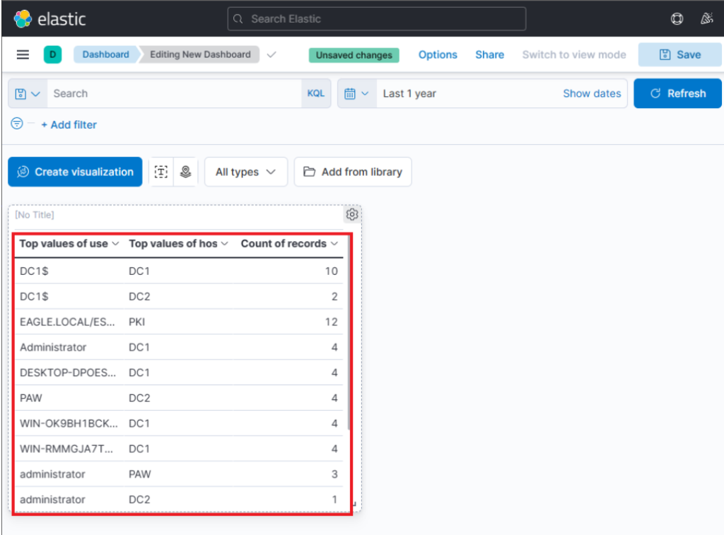
Finally, I click “Save and Return”, and the new visualization is added to my dashboard, appearing as shown in the following image.
Step 4: Refining the Visualization
After feedback from the “SOC Manager” scenario in the lab, I refined the visualization:
Renamed column headers for clarity (e.g., Username, Event logged by).
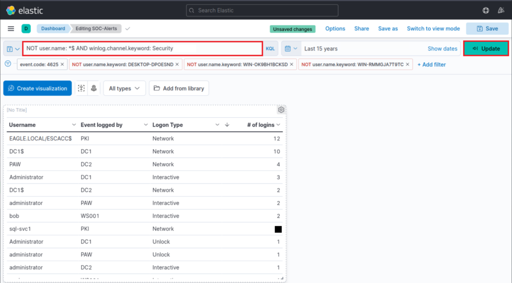
Added the Logon Type field (winlog.logon.type.keyword) to understand how the failed attempts occurred.
Sorted the table by # of logins in descending order to surface the most suspicious accounts first.
Applied filters to exclude:
Specific noisy accounts: DESKTOP-DPOESND, WIN-OK9BH1BCKSD, and WIN-RMMGJA7T9TC.
Computer accounts in general, using KQL:
NOTuser.name:*$ AND winlog.channel.keyword: Security
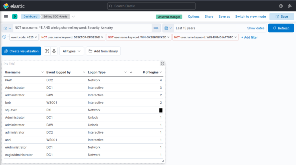
Step 5: Results & Key Finding
The refined dashboard successfully highlighted failed logon attempts by real user accounts, filtering out irrelevant noise from computer accounts. In particular, I identified that the account sql-svc1 had 2 failed logon attempts.
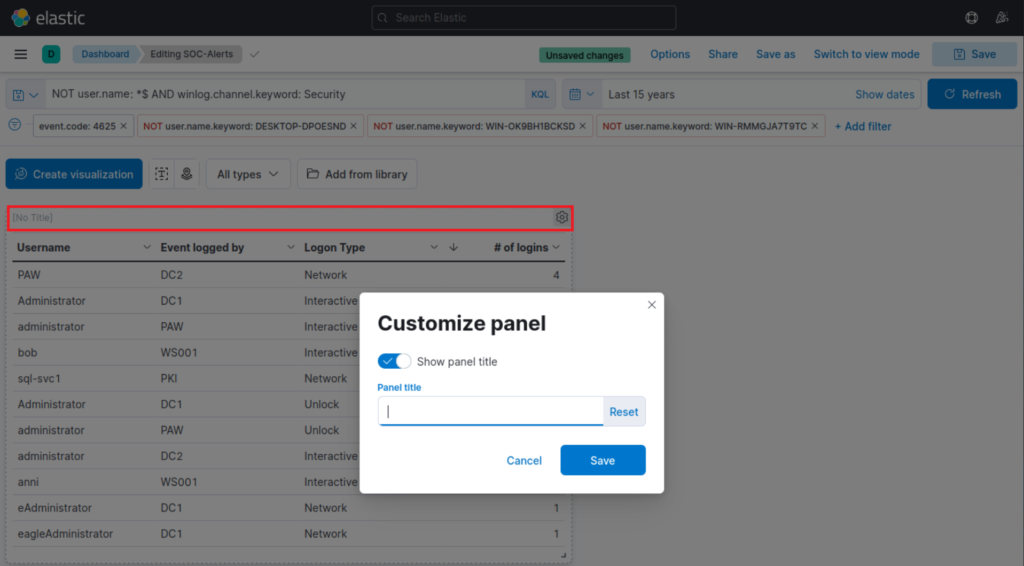
Finally, I give the visualization a title by clicking on "No Title"